What makes our website better than before?
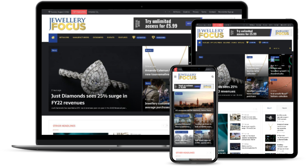
Hopefully you’ve noticed that you’re reading this blog on a vastly improved user interface. It’s true, we’re very proud indeed of the new-look website, with its Web 2.0 styling and quick-to-access news stories. So I thought I would take the liberty of offering some reflections and recommendations to help you get the best from it.
My decision to start haranguing the publisher for more yet more budget to invest in our digital products began last August. A Daily Briefing with auto-generating metal prices was the first thing I managed to convince him of the need for. Many readers have told me this is now a fixture in their daily routine. However it was also at that point that I planted the seed for a new website that would set a new standard for the media outlets in the jewellery industry. Many tenacious moons later, he got his chequebook out. You’re reading this on the stunning result.
Our old site looked as so many news sites look – carbon copies of what the major national newspapers were doing 10 years ago. Menus and categories, the right-hand column stuffed with advertising, but not much in the way of editorial content… this all means that the visual appeal of adverts is lost and the space in which the editorial can sprawl was constrained. Only the most fleeting of glances at Guardian.co.uk or Time.com, or indeed i00.Independent.co.uk, will reveal that the old style of online news is out, slick graphical presentation and fast loading times are in.
When we got around the table to discuss just how radically to shake up the look and feel of the site, my view was this: “Tear up the existing site and start from scratch, drawing from all of our favourite news organisations.” That’s why we’ve got that distinctive ‘news pane’ on the left-hand side, like Time.com and the Indy, so that no matter where you are on the site, you’re a click and a swoosh away from the other news we’re covering.
That’s why we’ve got a menu re-arranged into News, Columns, Features and Watch Focus. What could be simpler in terms of arranging our content?
That’s why we’ve got photo galleries attached to articles; it’s why we’re posting twice as much of our print features (albeit with a three-week delay to give our print subscribers preferential treatment); our new Jewellery Focus Visits series on the homepage; our Advice and Voices content divided up into easy-to-access sections.
In short, our intention in launching this new website was to be the very best in the market at delivering first-class jewellery industry news and editorials.
We hope you enjoy using it.

